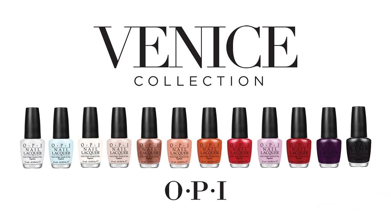
OPI Venice is classical but still interesting fall 2015 collection from OPI. They covered wide range of colours from pastel blue to the darker red.
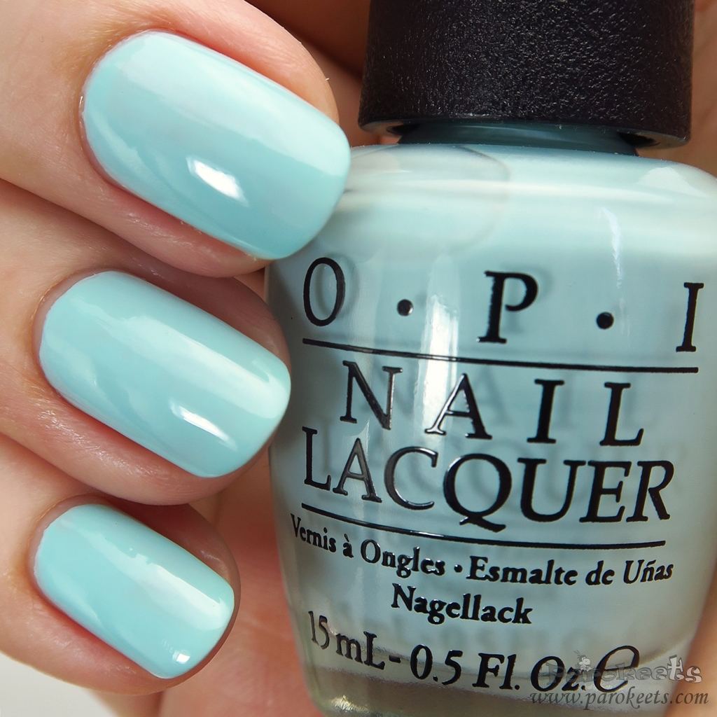
I do love Zoya formula more (Flair&Focus collection), but OPI totally got me with their colour range. I kind of like even OPI Gelato on my mind, and I’m more “pastels are to be worn very sporadically” type of person.
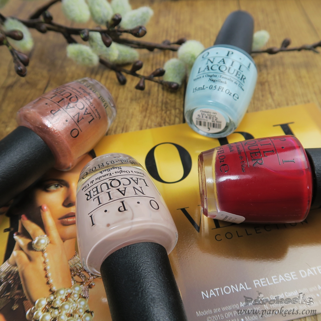
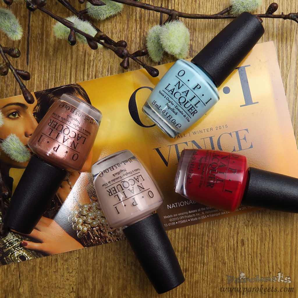
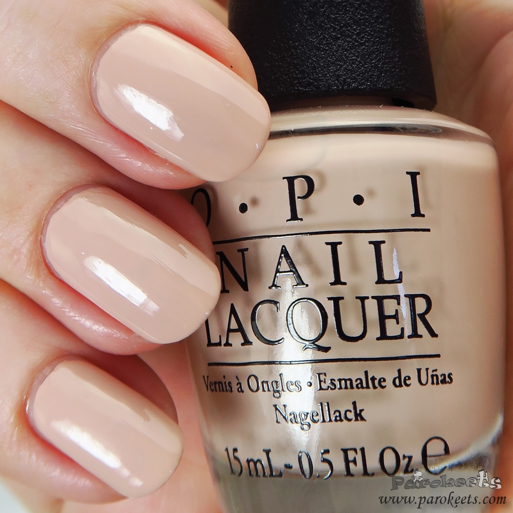
OPI Tiramisu for two is one of those almost universally flattering nude tones. Not really something for extremely cool tones, but otherwise it looks really hot on majority I saw it on. It gives you just enough colour so your hands don’t looks washed out, but instead it prints “classy” label onto your manicure. Application is not fast and simple. But second coat will disguise all “ups” moments.
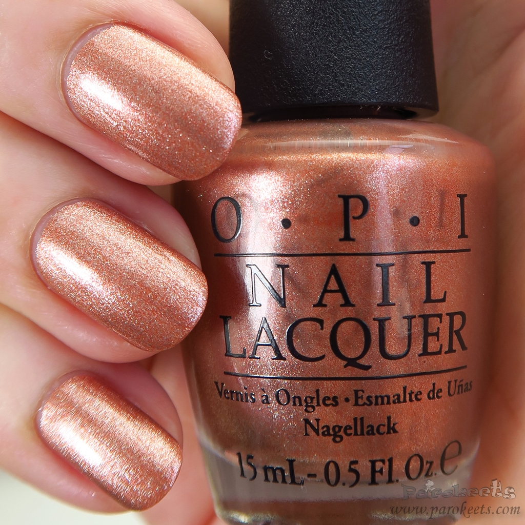
OPI Worth A Pretty Penne was no love at first sight even by a long stretch. It looked way to light coppery shade in the bottle and some strange things were peeking out of it. After I put it on, my opinion changed dramatically. Hopefully, you can see the depth and beauty of this nail polish in swatch photo. Simply fantastic combo of coppery base and slight reddish particles that make all the difference. Great shade to spice/lighten up autumn manicures (plaid one in Fall trends for example). Application was non problematic with good staying power.
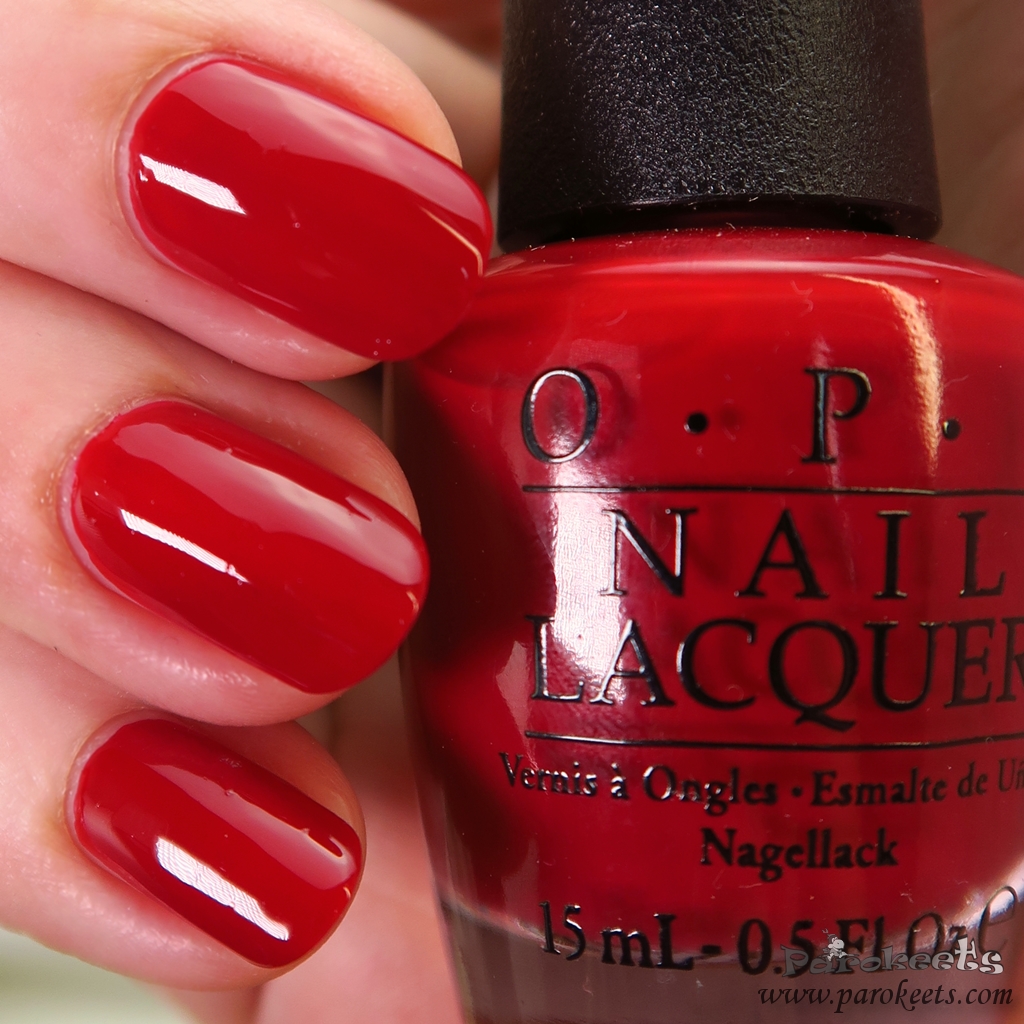
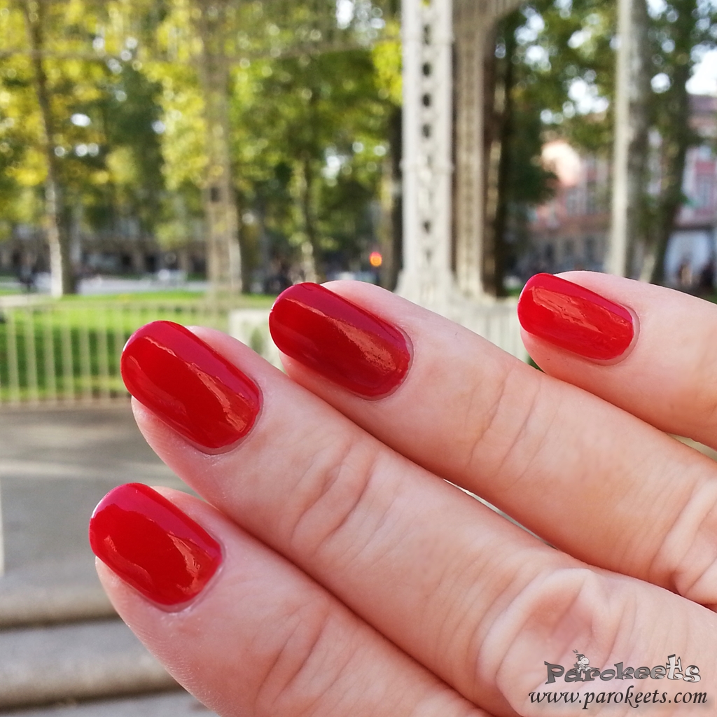
If you put cool dark red nail polish in front of me, you have to have something really mind blowing on the other side of the scale to win me over. OPI Amore at the Grand Canal is one of those perfect red shades that never go out of the style. Great coverage, very easy application and looks marvellous with my skin-tone. Most of you will say – classic = boring, but guess which shade received the most compliments this fall? Exactly – red.
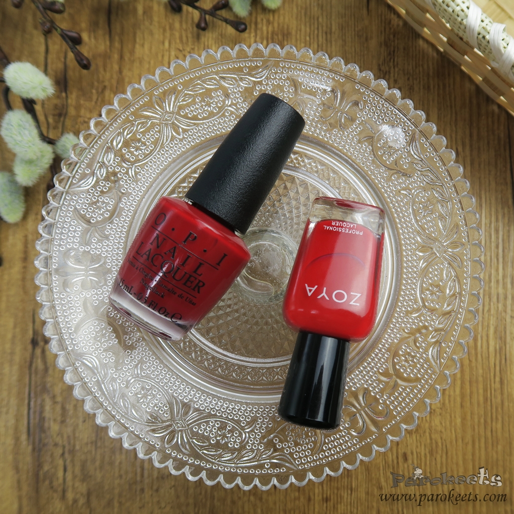
Zoya Hannah is lighter in comparison to OPI Amore at the Grand Canal and more neutral. Quality wise they are very similar – great formulas, possible one coaters, good staying power.
What do you think? Which shade it THE prettiest?
*red and copper shades were sent to me for review purpuses
This post is also available in SLOVENŠČINA.
Lušni odtenki, me je pa sinje moder najbolj začaral
Oh, ko sem že mislila, da je Coca Cola to to…. Gelato on my mind, miljon videnih odtenkov podobnih, ampak tale ima tisto minimalno drugačno in…..mela bi ga!!! <3 Čisto si me zdej s temi swatchi :/
Rdečko je pa tudi krasen, veliko lepši mi je kot Zoya.
OPI je prav strokovnjak, da doda malo magičnega prahu in te premami k nakupu podobnega odtenka. :biggrin:
Uf, rdečko je lušten :yes:
Mhm, me mika da bi ga spet dala gor. :silly:
Uau, tudi meni je Tiramisu for two zelo lep! Sicer imam že tisoč takšnih lakcev, ampak nevtralno je zakon!
Se pa nebi branila tudi Worth A Pretty Penne!
Lp! :party:
Jaz sicer nisem nora na nevtralne barve, ampak tale je pravi posebnež … v dobrem smislu.
MMM, Tiramisu for two :wub: